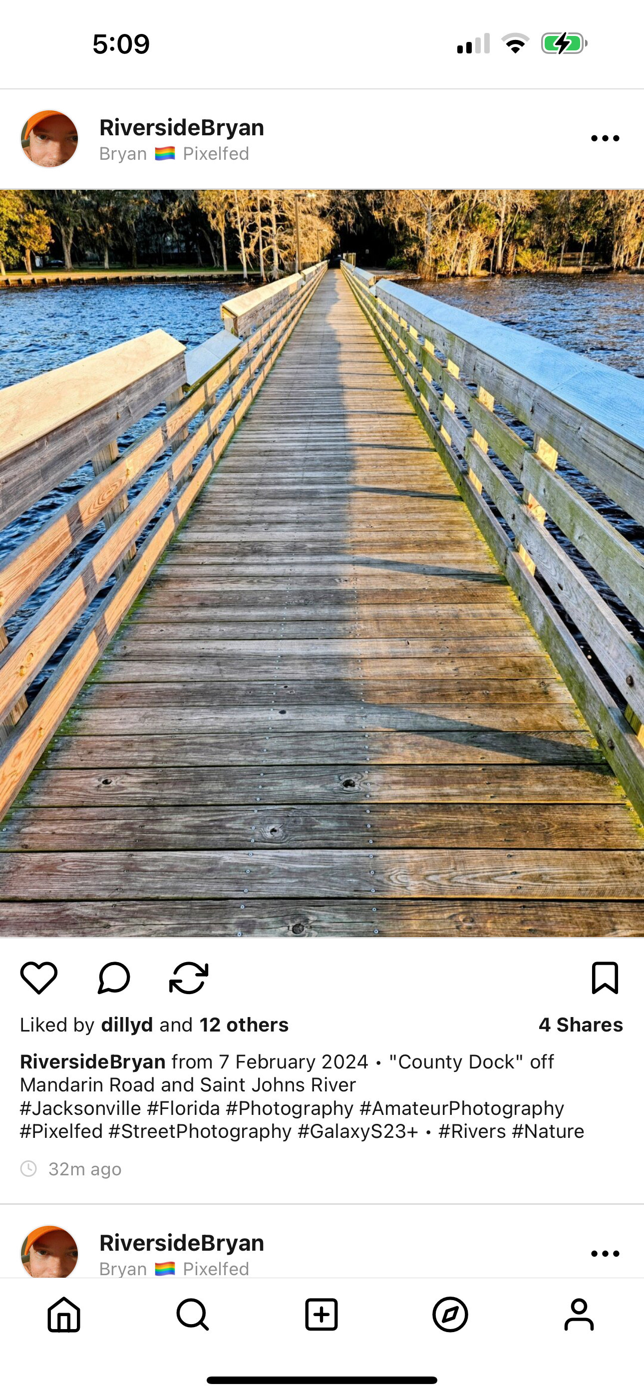
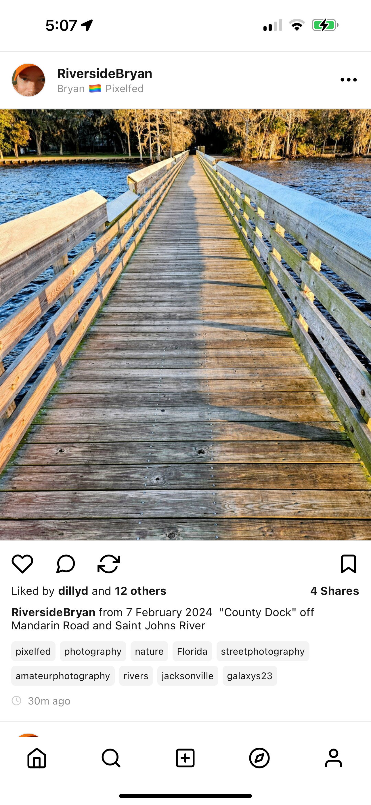
42
Share
Share on Mastodon
Share on Twitter
Share on Facebook
Share on Linkedin
Marcello Lamonaca

@dansup I find "hashtag buttons" more readable and overall nicer

0
8mo
dansup

@pixelfed If we go this route, we'll likely limit the # of hashtags with a "show all" to load more if applicable.

This is growing on me though, and this is inspired by @Gargron work on tag buttons in Mastodon!

1
8mo
nicolas

@dansup @pixelfed Looks good! Much cleaner and more parseable. I do however think it’s important to keep the capitalisation and the tag order that the person chose? Those can convey meaning.

1
8mo
pieceofthepie :coffefied:

@dansup @pixelfed I like the idea of buttons but they've "lost" the identity of being a hashtag by not having, you know, a hash.

0
8mo
HerrHerrmann

@dansup @pixelfed I think it’s helpful to have them shown in this new button style!
I’d also suggest increasing the line height of the description text. Currently, it’s very tight which doesn’t look great, and makes reading multiline descriptions harder.

0
8mo
laurel

@dansup @pixelfed As somebody who lives for the captions as much as the photos, the separate hashtags look a lot more inviting (esp. for longer captions)!

0
8mo
Mike Dreier

@pixelfed @dansup I am excited about the hashtag buttons and would prefer this version. How would it be if you could select this yourself via a setting in the settings? That would please both camps.

0
8mo
Chee Aun 🤔

@dansup from my observation (in IG), most folks there purposely "hide" hashtags by putting in a lot of newlines (and force "show more") or add them via a comment instead of post description. Surfacing them this way seems to undo their intentions in my opinion 🤔
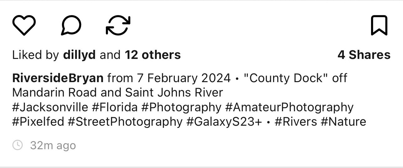
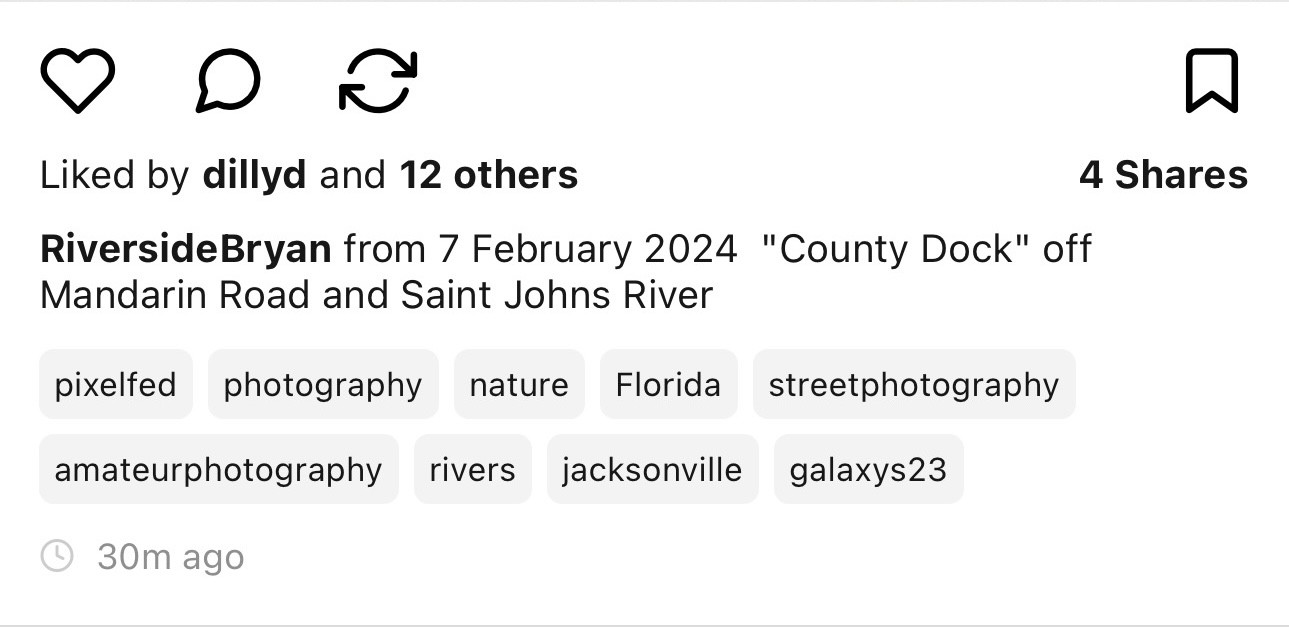
1
8mo
φ

@dansup @pixelfed how would a hashtag be handled if it's surrounded by normal text?

0
8mo
Oblomov

@dansup @pixelfed separate id better for end-of-text tags, obviously. What happens to inline tags?

0
8mo
SunDancer

@dansup @pixelfed personally I like the "old school" #Hastag better. These "hastag bubbles" just don't do it for me.

0
8mo
Shlee-able :he_him:

@dansup @pixelfed hellllll yesssssssss

0
8mo
0
8mo
Steven Impson

@dansup @pixelfed Way prefer the second, button style. Looks intentional rather than the hack that hashtags began as.

0
8mo
Dark and and Stormy

@dansup @pixelfed As pixelfed is a visual platform to begin with, I would vote for the hashtag buttons.

0
8mo
ernmander

@dansup after definitely

0
8mo
Ultrasquid 💀

@dansup @pixelfed definitely a lot better and infinitely more readable.

0
8mo
Chris 🦑

@dansup @pixelfed love, love, love it!
I always was annoyed by the hashtag spam cloud at the bottom of (IG) posts and wonder why hashtags weren't handled separately outside the original caption - like EyeEm did it when they were cool.

0
8mo
P’undrak :emacs: :archlinux:

@dansup @pixelfed That’s a lot nicer! Before looks a lot more cluttered than after.

0
8mo
Alexander Hamizdat

@dansup @pixelfed as long as you don't do the thing where hashtags in the middle of the text get ignored

0
8mo
Replies