- 8mo ·
-
Public·
-
mastodon.social
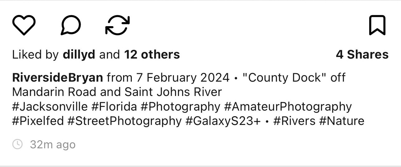
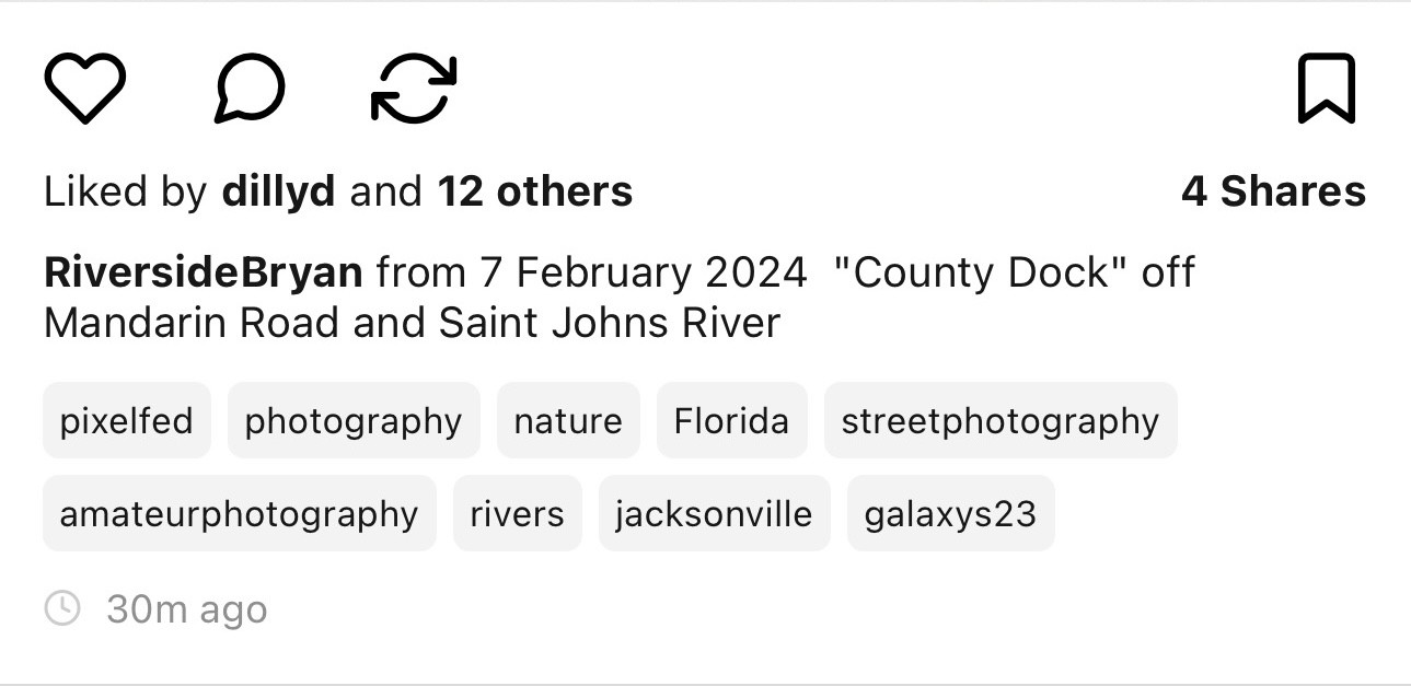
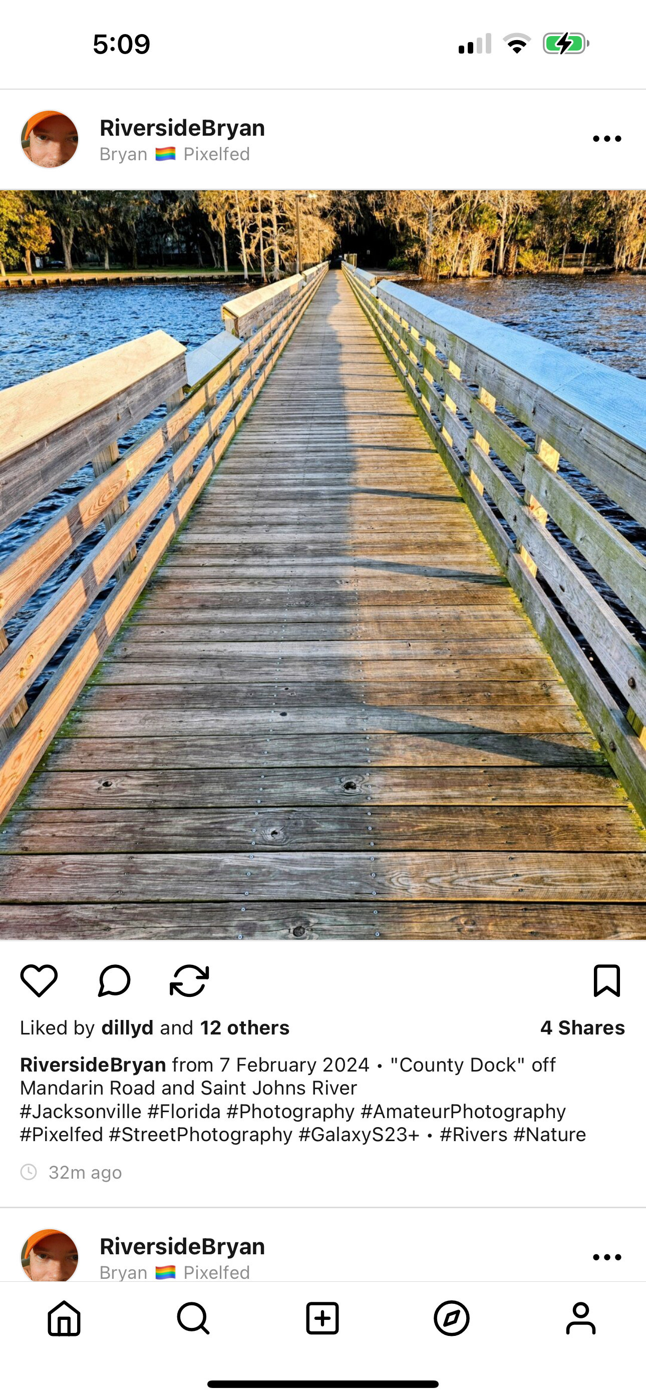
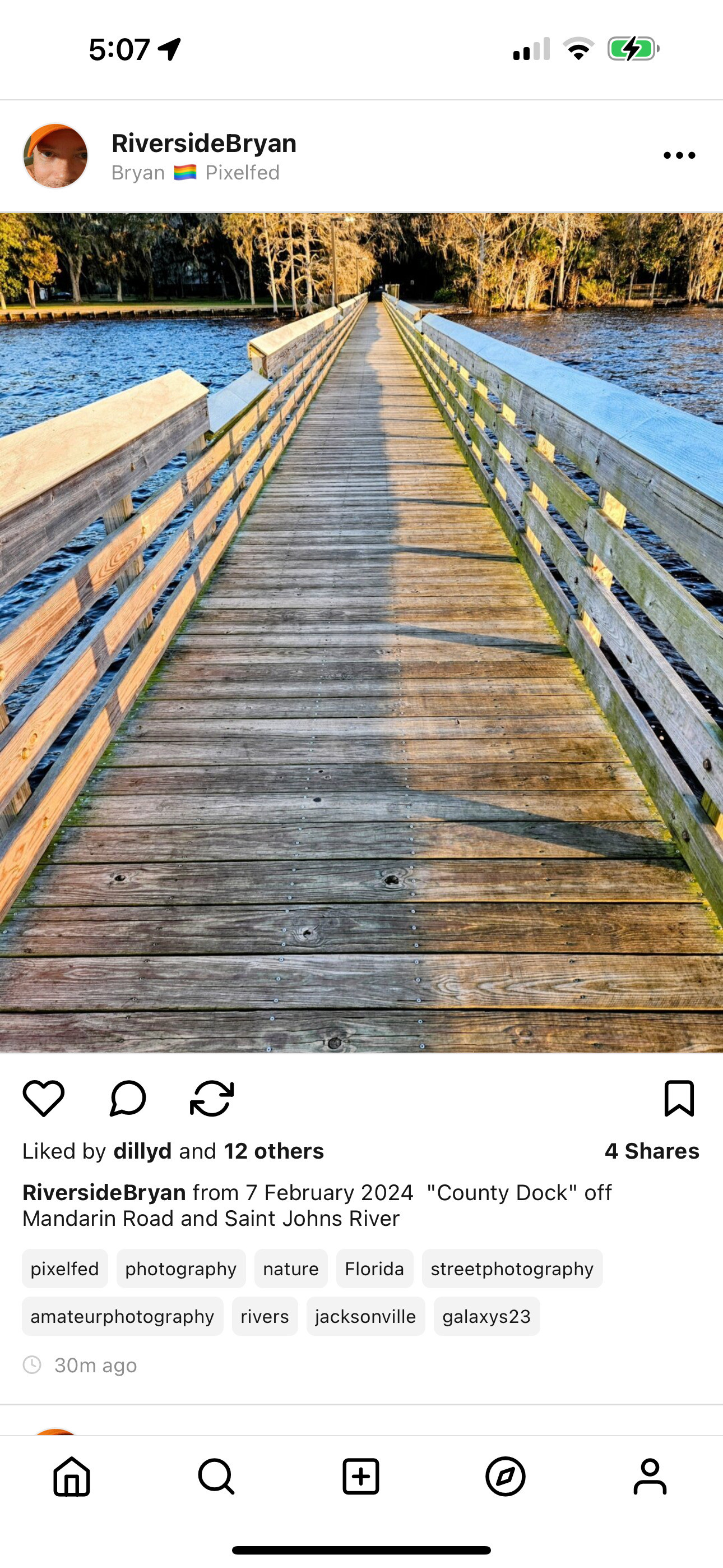
@dansup @pixelfed I like the pill display much better. 👏🏻
1. However, keep the letter casing untouched.
2. Maybe add a # at the beginning of each, so that we immediately understand that they are hashtags. Or add a "Tags:" label at the beginning of the list.
Also, what is the behavior with hashtags in the middle of the text? Are they cut off?
@dansup @pixelfed I would caution against lowercasing tags since concatenated CamelCase words are useful for legibility and accessibility.
Visually this style is more pleasant, but might cause people to new to the platform to not know how to create tags (i.e. by prefixing words/phrases with a #).
You'll also have to contend with how this content appears in feeds or via the API.
Also: how would #hashtags appear inline?
@dansup @pixelfed I much prefer the new version, but as others pointed out, I think maintaining the case is important.
I would also like for the # signal to be kept to make it more explicit, which I feel is specially more relevant when the hashtag is in the middle of the text for example (which I assume would still be possible, it would be horrible to not be able to use hashtags in the middle of the description).
@dansup @pixelfed Like the second one much more, looks cleaner, nicer and more organized too. The improve readability is a plus and it can help with accessibility too! I'd say go for the 2nd option, limiting the amount of hashtags visible will also help reduce post clutter and make it a much more enjoyable viewing experience
Ummmm...
Neither, really. Or both, perhaps. A combination of the two really, like the following?
https://zotum.net/channel/tallship?mid=ef5f6382-d98f-46f8-a9de-0f57b6ac4940
As you can see, you're only addressing the tags as #labels following a post, whilst most folks tend to #hashtag their #articles inline as they type out their posts.
Having a facility to integrate those two methods is of great benefit and note that in my example not all #tags are duplicates between the two methods of presenting them.
⛵
.


