3
Share
Share on Mastodon
Share on Twitter
Share on Facebook
Share on Linkedin
Wervice :fedora: :linux:

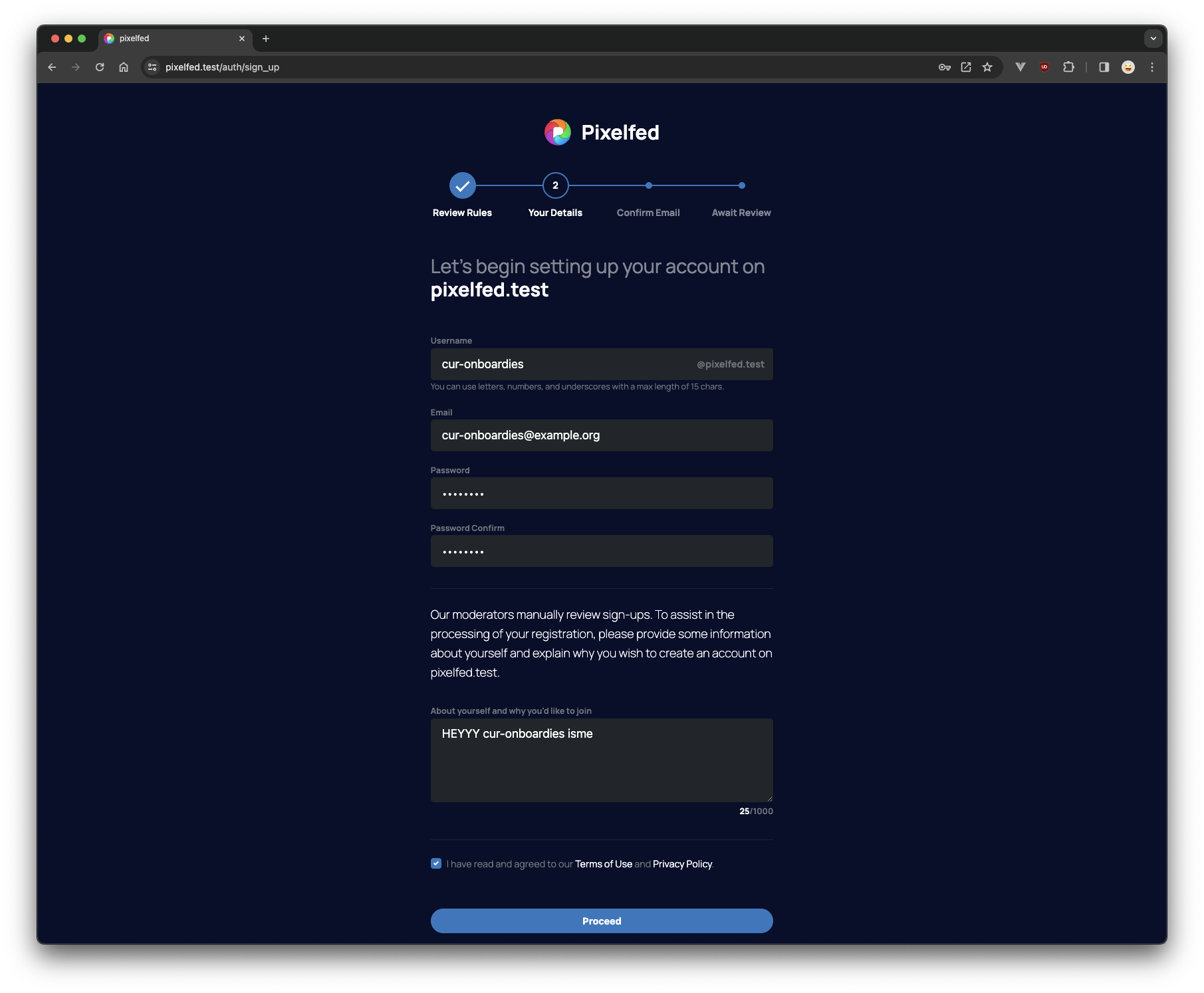
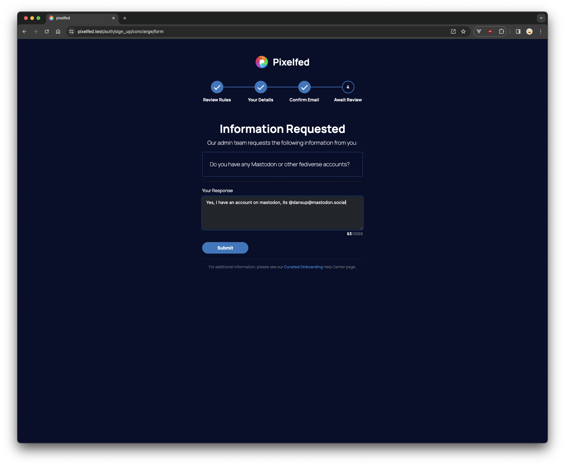
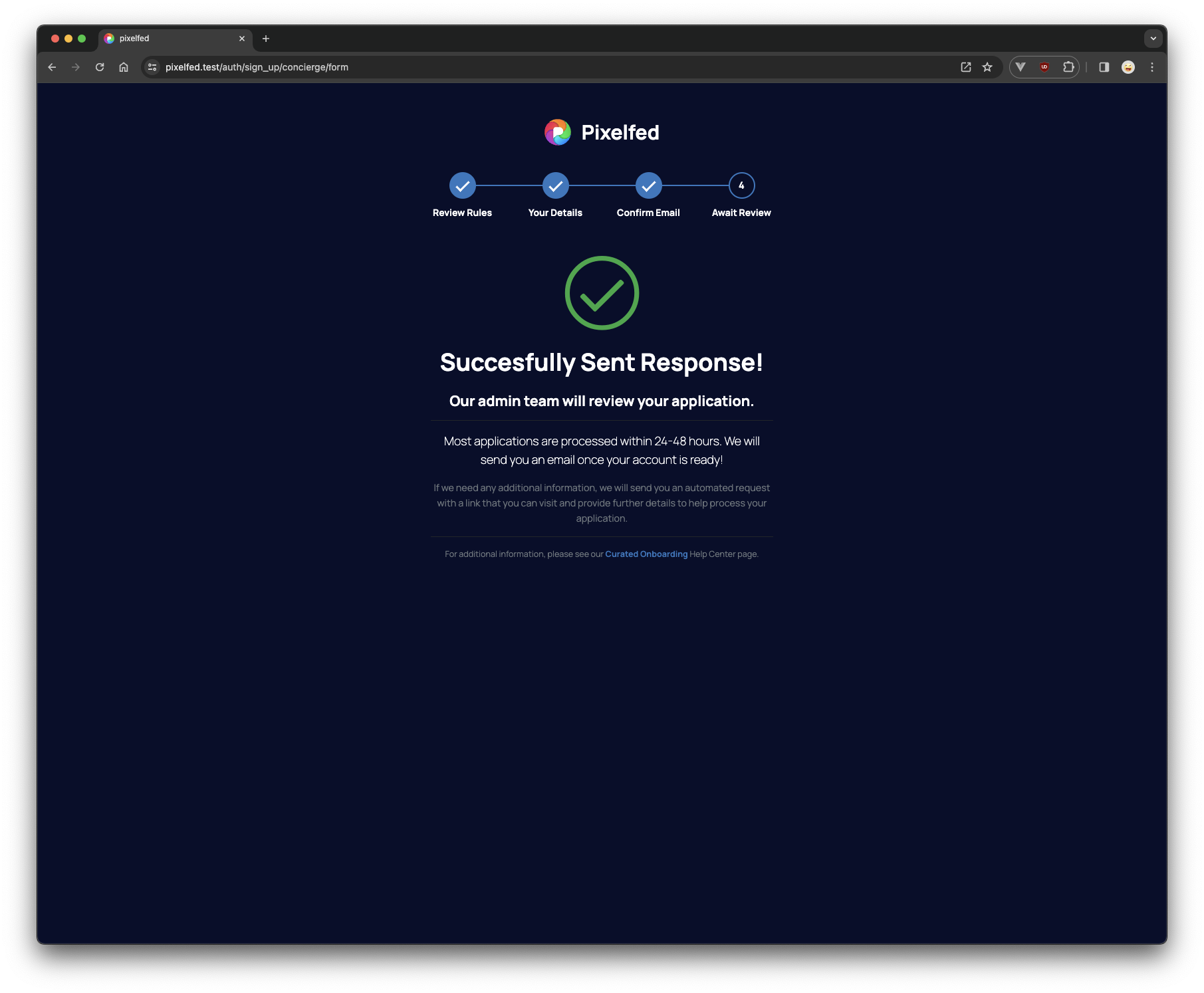
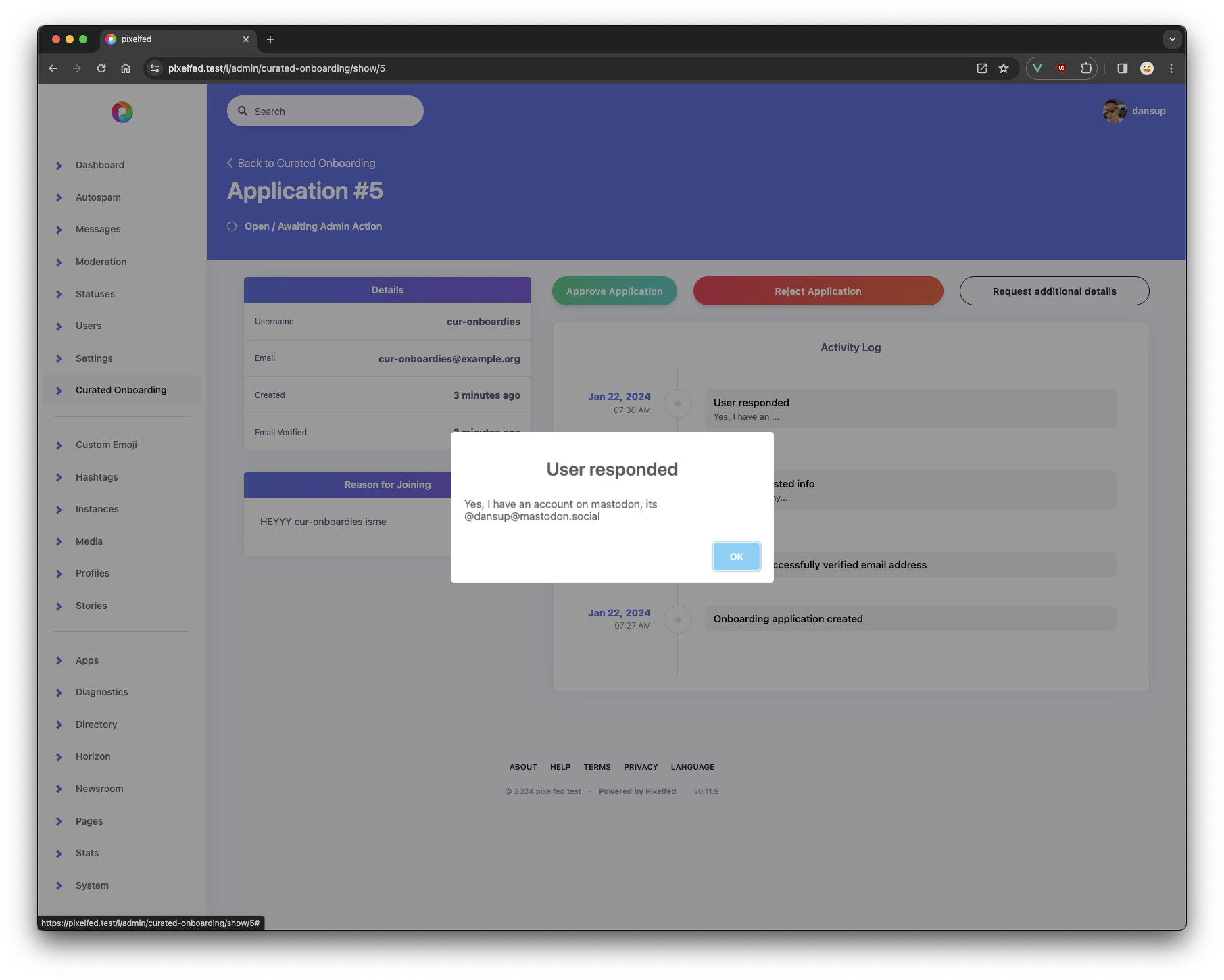
@dansup Looks super nice.

A very small note from my site: I think it would look better if the inputs were blue, too. Maybe a darker blue.

0
10mo
Steve

@dansup I’ll out myself as a complete newb here: Isn’t there fedi SSO?

0
10mo
Tommy Boy :verified:

@dansup Ooo nice. Building a similar user account system for my nonprofit and curious - what's your breakpoint there? Mine's ~800px I think. Whatever mine is it's way too wide. But at least your step one page length makes me feel better about mine. Good job

0
10mo
Replies