{"p":"","h":{"iv":"ROXSYW+cfvEbFHu5","at":"ocxplSQjdRC3tXEtB/9/wg=="}}

dansup

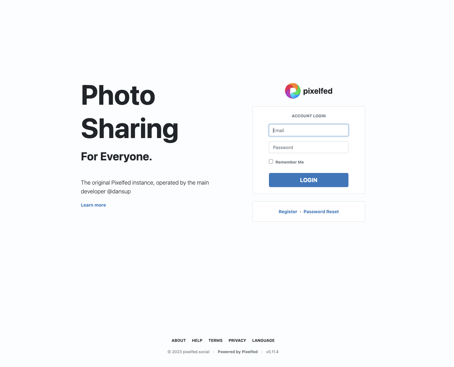
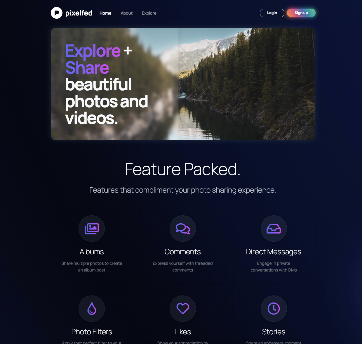
Taking a break from development to redesign the :pixelfed: landing page (what you see when logged out)

Compare the current design with the WIP design, feedback appreciated!

19
Share
Share on Mastodon
Share on Twitter
Share on Facebook
Share on Linkedin
Paolo

@dansup a beautiful landing page πŸ‘

0
2y
Braw :blob_cat_melt:

@dansup forced dark mode πŸ˜”

1
2y
John Samuel

@dansup Like the new proposed version. It misses the explore option (unless it's a deliberate decision).

1
2y
Fernando Mateus

@dansup Definitely better πŸ‘Œ

Gorgeous improvement, the difference between night and day. πŸ‘Š

0
2y
Stefan Winopal

@dansup I really love the new WIP design. I would put the least expected features (read: the ones pixelfed has that Instagram has not) to the top. Or the most highly used, if you have data. Maybe that’s what you already did, so then it’s just a great redesign πŸ˜‰

0
2y
Mike

@dansup nice design upgrade! The new looks great!

0
2y
dansup

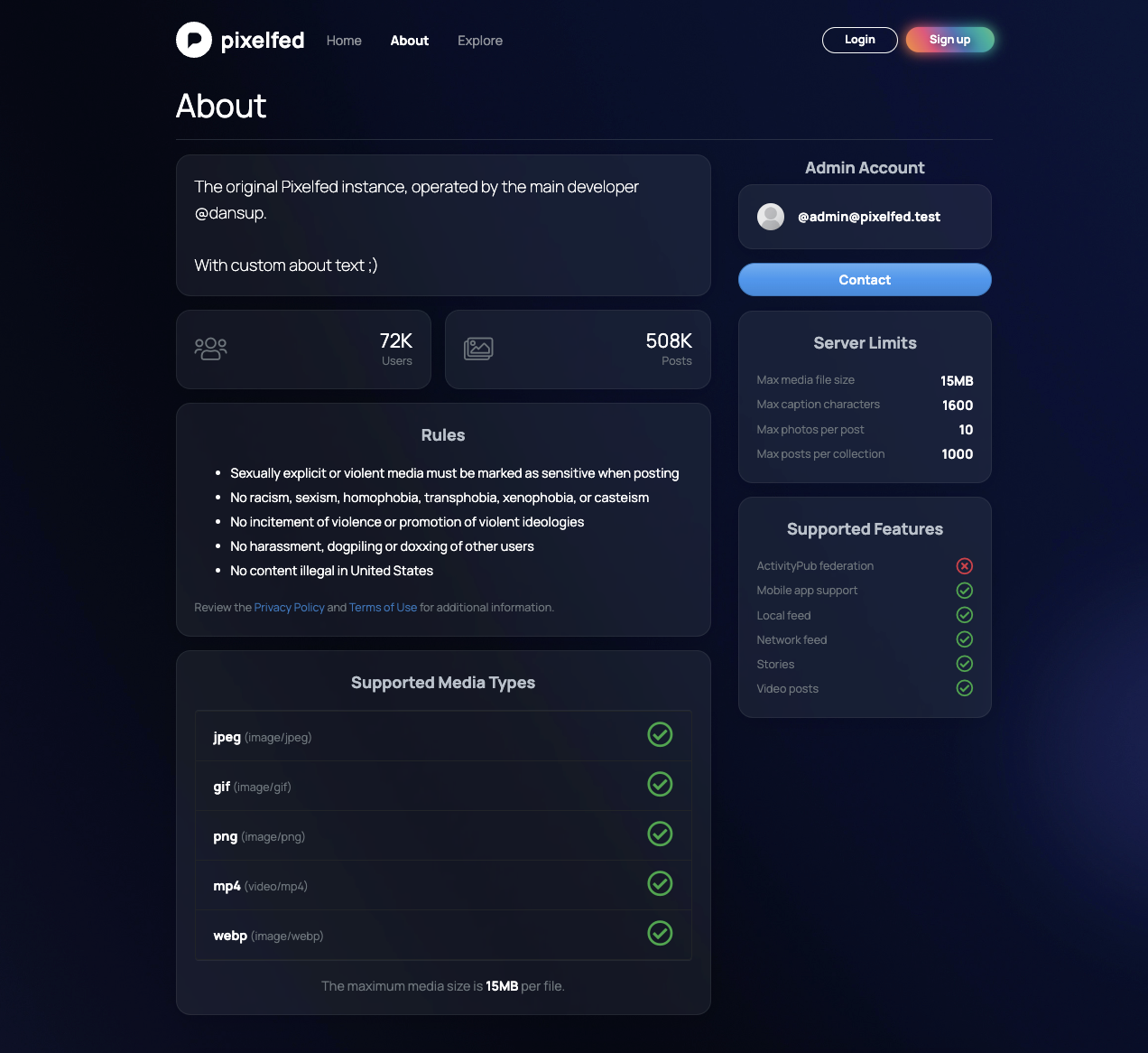
This is the new About page, admins will be able to easily customize the hero text.

This gives a pretty good instance overview IMO

Any suggestions on how I can improve this?

New instance about page
9
2y
0
2y
Levi

@dansup This is beautiful! Great work! When the logo is solid like on the WIP, I do feel a little bit of the identity is lost.

Maybe if you played with the alpha values of the whitespace surrounding the "P", breaking it up the same way as the full color logo, you can bring that back?

0
2y
Asahi 95 βœ… :opensuse: :kdenew:

@dansup
Really loving the landing page, looks absolutely stunning!

#pixelfedapp #pixelfed #pixeldev

0
2y
Chokri K'

@dansup looks amazing 😍

0
2y
Kiran Babu

@dansup Probably nit-picking, but should the sub-text to "Feature Packed." be "Features that complement your photo sharing experience" (instead of "compliment")?
The page looks great! Is there an equivalent light mode too?

0
2y
Ehsan

@dansup that's great

0
2y
Archnemysis

@dansup I think I am confused. Is this what a default instance homepage would look like, the home page for the product as a whole, or the home page for your specific instance? If an instance homepage, there should be a prominent section about what makes that instance unique or sets it apart from others. To me this home page feels like it is more about the product as a whole, while the about page is for a specific instance.

0
2y
Oliver Pfleiderer

@dansup
Looks good! The icons could sport a little more contrast for accessibility though.

#pixelfedapp #pixelfed #pixeldev

0
2y
Tomkoid

@dansup looks very good

0
2y
Beto

@dansup marginally better πŸ˜‰good job!

0
2y
Dale Price

@dansup Is this meant to promote Pixelfed as software for prospective instance admins, or as a platform for users? It looks like it’s trying to answer the question β€œI want to host a photo sharing site, does this software cover all the bases?”

not β€œI like to share photos with people and interact with them, is this the place I should go to for that?”

0
2y
CubeOfCheese

@dansup I think more important than listing features is showing a screenshot of what a post looks like. It conveys a lot of information about the platform, content, and style efficiently to a person who is considering whether to sign up

0
2y
Replies