dansup
- 1y ·
-
Public·
-
mastodon.social
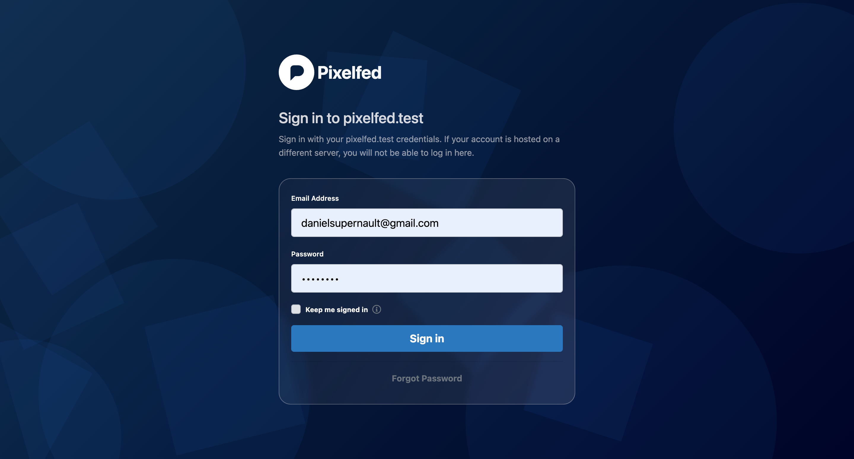
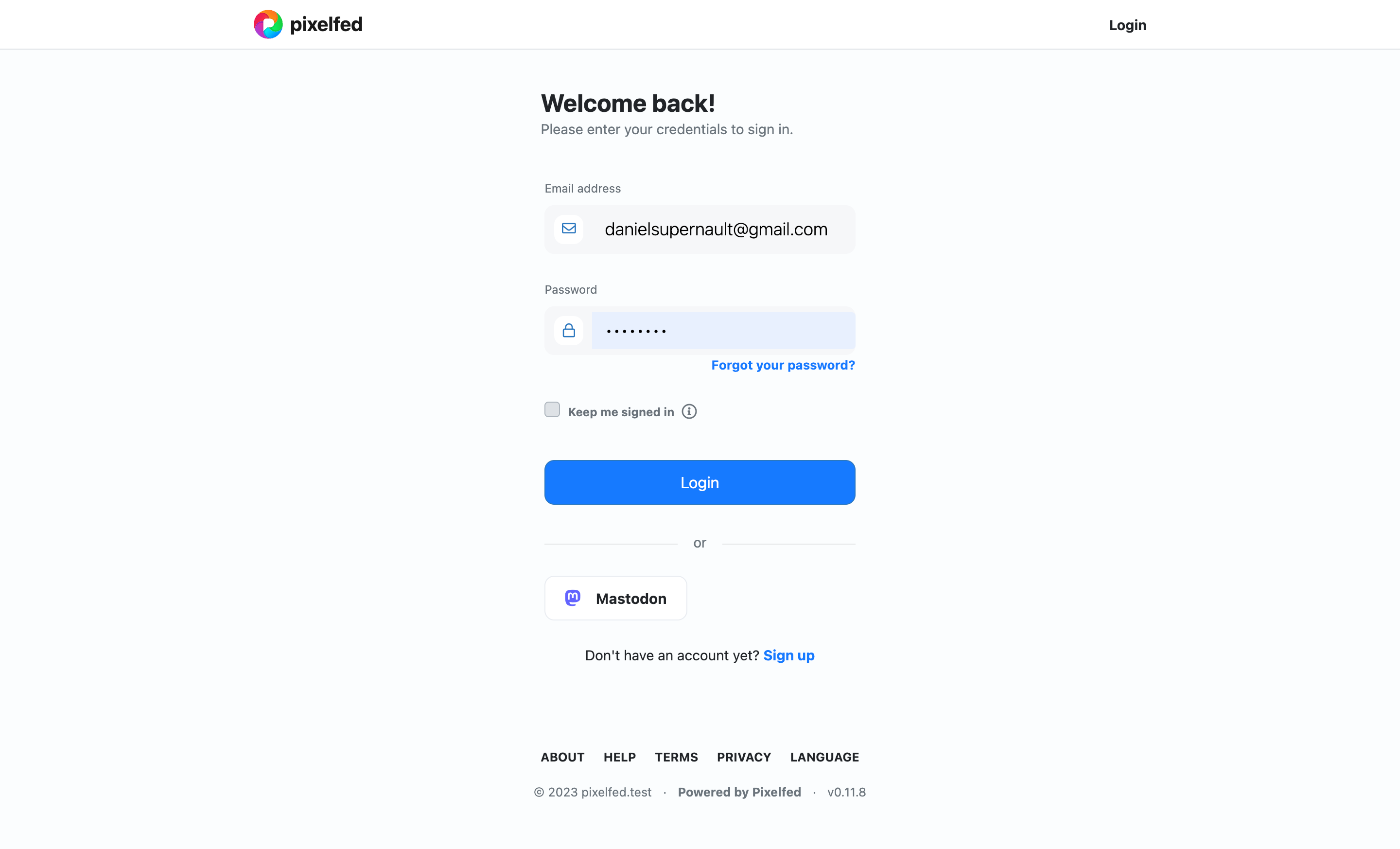
Login v2 vs v3 design
The v2 design was more bold and distracting, I decided to start from scratch using a similar layout to the existing design for v3 to keep the focus on the intent/action
v3 uses animations and loading indicators when applicable and is overall a better UX IMO
Password resets and 2FA is also much better in v3

