19
Share
Share on Mastodon
Share on Twitter
Share on Facebook
Share on Linkedin
N.R.

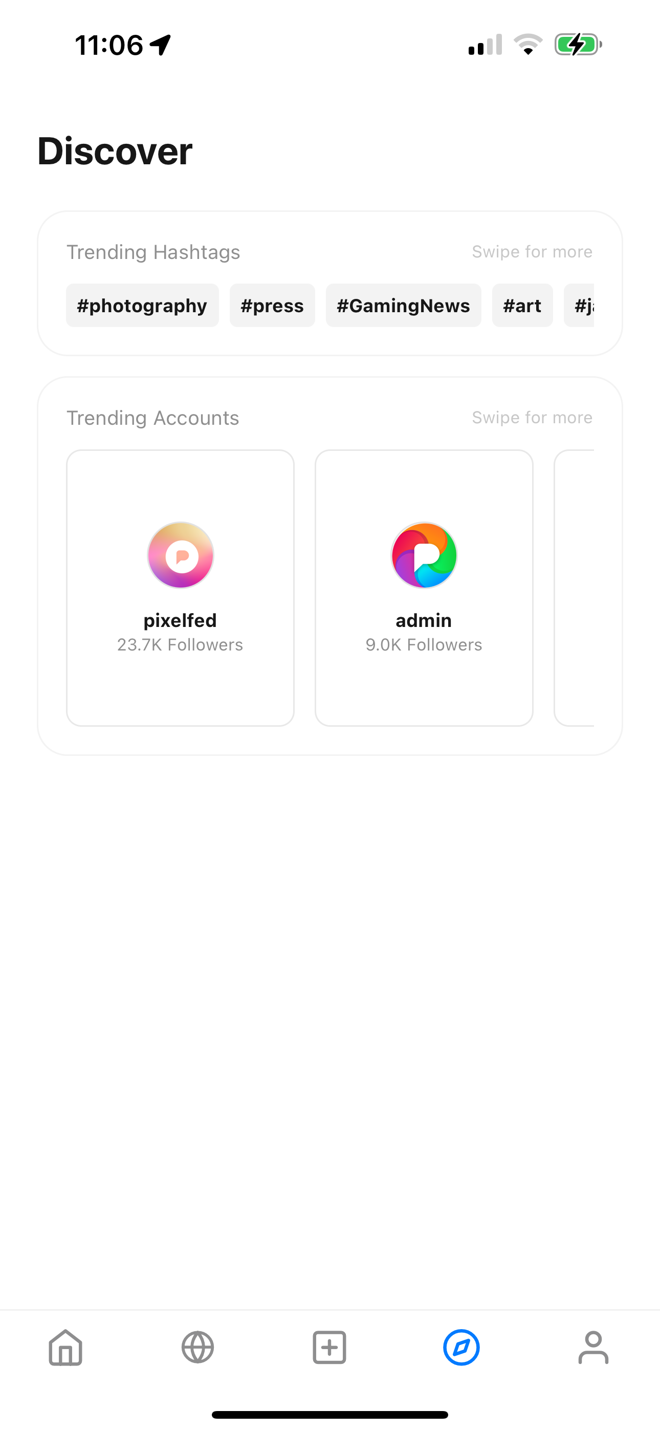
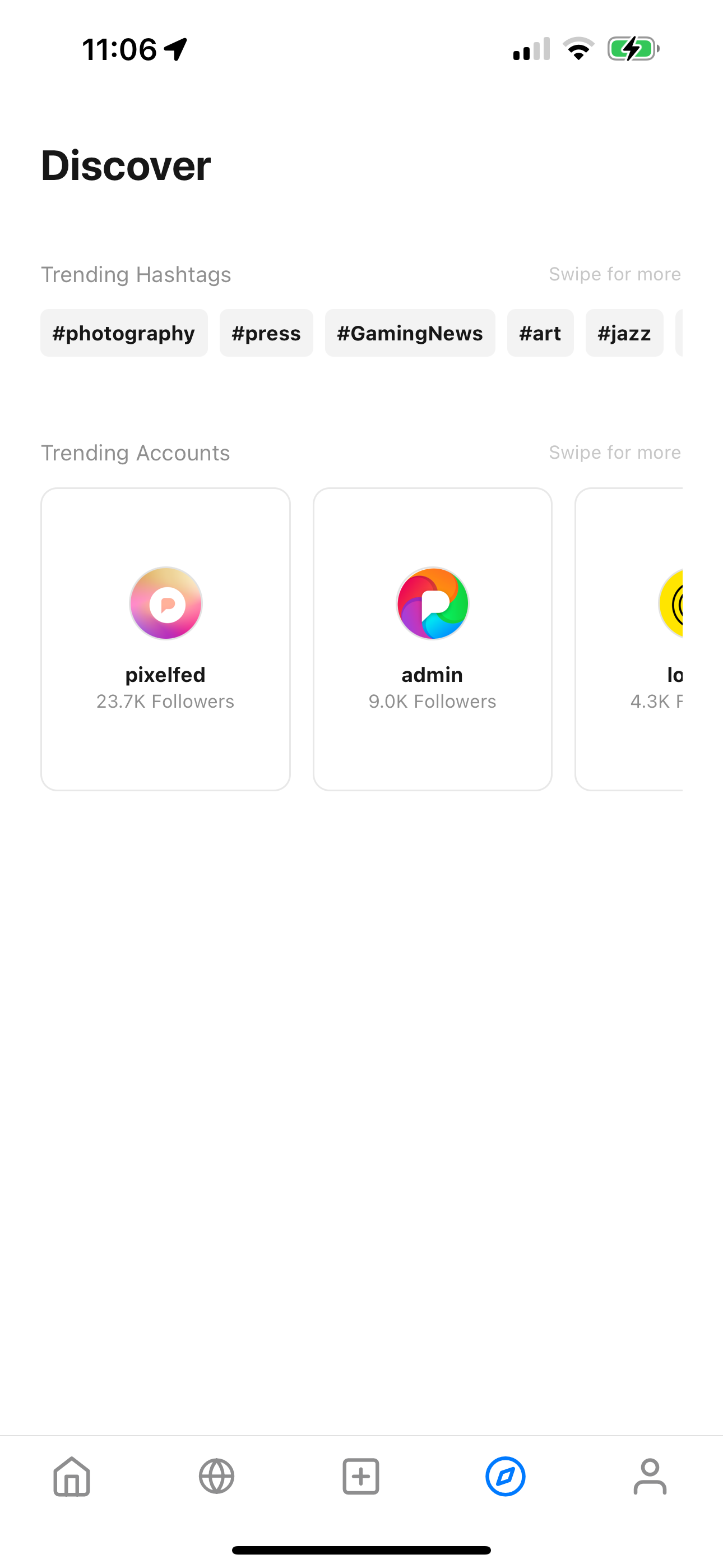
@dansup no border

0
7mo
0
7mo
Mohammad Kazemi

@dansup
Unbordered, I guess.

0
7mo
Plumeros ☮️

@dansup
less is more: no borders.

0
7mo
Joe Cooper 💾

@dansup no borders. (also no gods, no kings)

0
7mo
Kaspar

@dansup Unbordered. You already have elements with borders there, no need to border them up even more.

0
7mo
technicat

@dansup unbordered

0
7mo
Kadsepfösch

@dansup unbordered ✌

0
7mo
Григорий Клюшников

Unbordered and either extend the horizontally scrollable areas to the edges of the screen, or mask their edges with gradients.

0
7mo
Григорий Клюшников

And remove the "swipe for more". It's bad when you have to explain your UI with words. However, in this particular case, it's redundant, because the peeking item acts as an affordance that tells the user that they can scroll.

1
7mo
Sunshine

@dansup Unbordered for me because I feel more relaxed looking at it. I feel a bit stressed when looking at the bordered one. Haha.

0
7mo
0
7mo
otter_linnus

@dansup unboardered

0
7mo
Mahesh Rijal

@dansup no borders :)

0
7mo
Enric Pineda :eo_flag:

@dansup I prefer unbordered, I guess.

0
7mo
Emelia 👸🏻

@dansup I'd probably go unbordered, but with some form of horizontal rule to separate content (e.g., border between)

0
7mo
Tarcísio Surdi

@dansup no border and maybe add a gradient to the sides in order for it to look more scrollable, removing the need for the “swipe for more” text

0
7mo
Sergio

@dansup unborderer

0
7mo
Replies