⚠️ Feedback wanted!

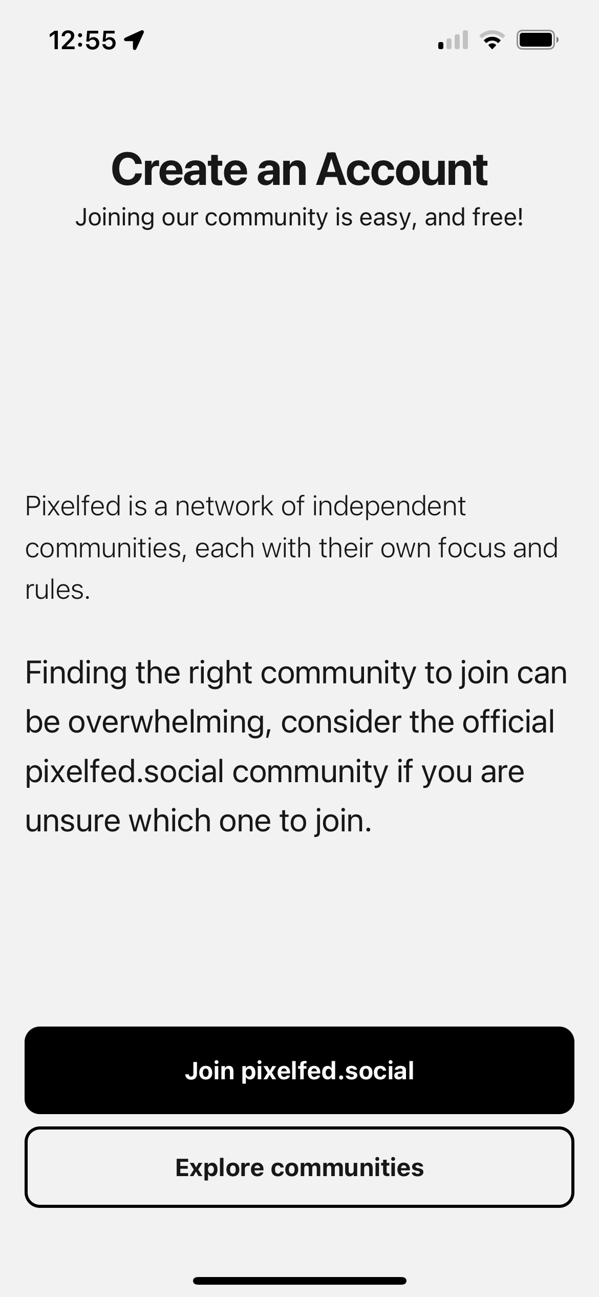
I'm working on improving the @pixelfed app onboarding, and want your feedback on the new sign up flow.

Does this do a good job at conveying the choice of communities to join while providing an easy default instance to join?

This isn't final, I'd like to get a general positive consensus on this before moving forward.

Boosts greatly appreciated!

30
Share
Share on Mastodon
Share on Twitter
Share on Facebook
Share on Linkedin
CubeOfCheese

@dansup @pixelfed it's a lot of text so I skipped right over it and read the buttons. With just reading the buttons is not clear that pixelfed.social is a community and the explore button is to look at alternatives. So I might change it to "Explore other communities" to imply that pixelfed.social is a community.

Pretty nitpicky. Other than that it looks great

0
1y
/@curt@mastodon.sdf.org

@dansup @pixelfed Ya. Just signed up. Process was mostly smooth. Joining a community was straightforward and clear. Getting told my username was already in use, and then having to retype my password twice seems like unnecessary friction.

0
1y
Jon

@dansup I like the revised version in general but on the scond screen you might want to give some positive reasons for looking at other communities. @pixelfed

0
1y
skry

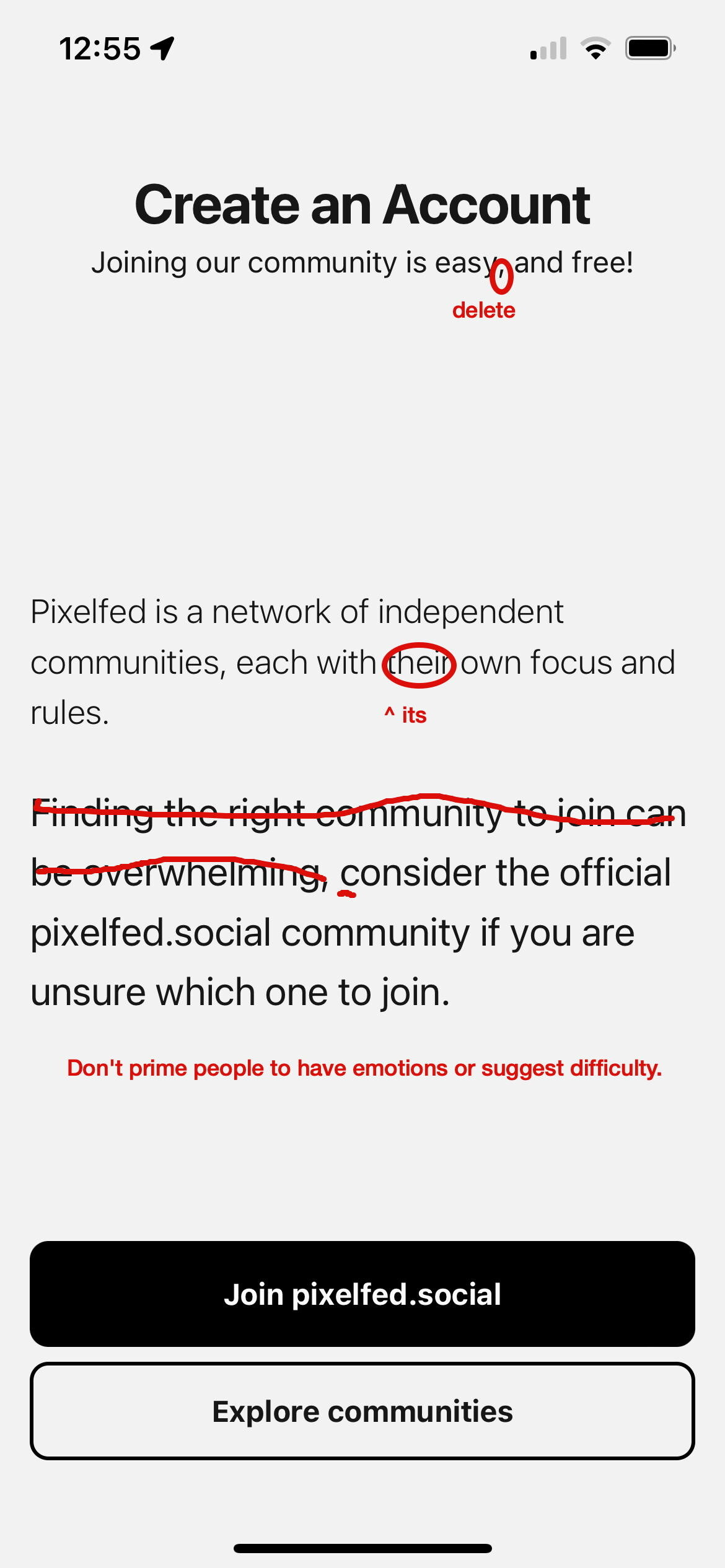
@dansup @pixelfed Some copy edit suggestions

0
1y
Replies