12
Share
Share on Mastodon
Share on Twitter
Share on Facebook
Share on Linkedin

@dansup you can do like Signal witch let you choose the logo you prefer ! 👌

0
1y
linuxct

@dansup it’s actually better than the two previous, congrats!

0
1y
Jon

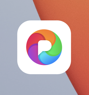
@dansup this one reminds me of the old Picasa icon

commons.wikimedia.org/wiki/Fil

0
1y
0
1y
Kunal Agrawal

@dansup looks better and gives the clear idea of PixelFed identity.

0
1y
focarafa

@dansup looks like something made 4 years ago. All the android apps are moving to a more minimall vibe icon. It really feels like it has born outdated :(

1
1y
Oscar

@dansup looks great! By why not expand the rainbow aperture to the full size and then expand the P also? The white background just dilutes the icon (and the many other apps which do the same thing) imo

0
1y
0
1y
0
1y
Replies