5
Share
Share on Mastodon
Share on Twitter
Share on Facebook
Share on Linkedin
CanadaMan 🏳‍🌈 :3

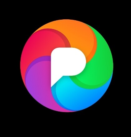
@dansup personaly i would like to se it as the webite logo

It pops up when you launch the app so it would make sence

Pixelfed Logo
0
1y
Felipe

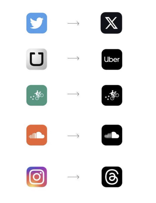
@dansup news, calendar, photos maps, wallet, social, messages, bank, all will eventually come from a single company called "company" and the logo would be just a black money sign $

0
1y
Dale Price

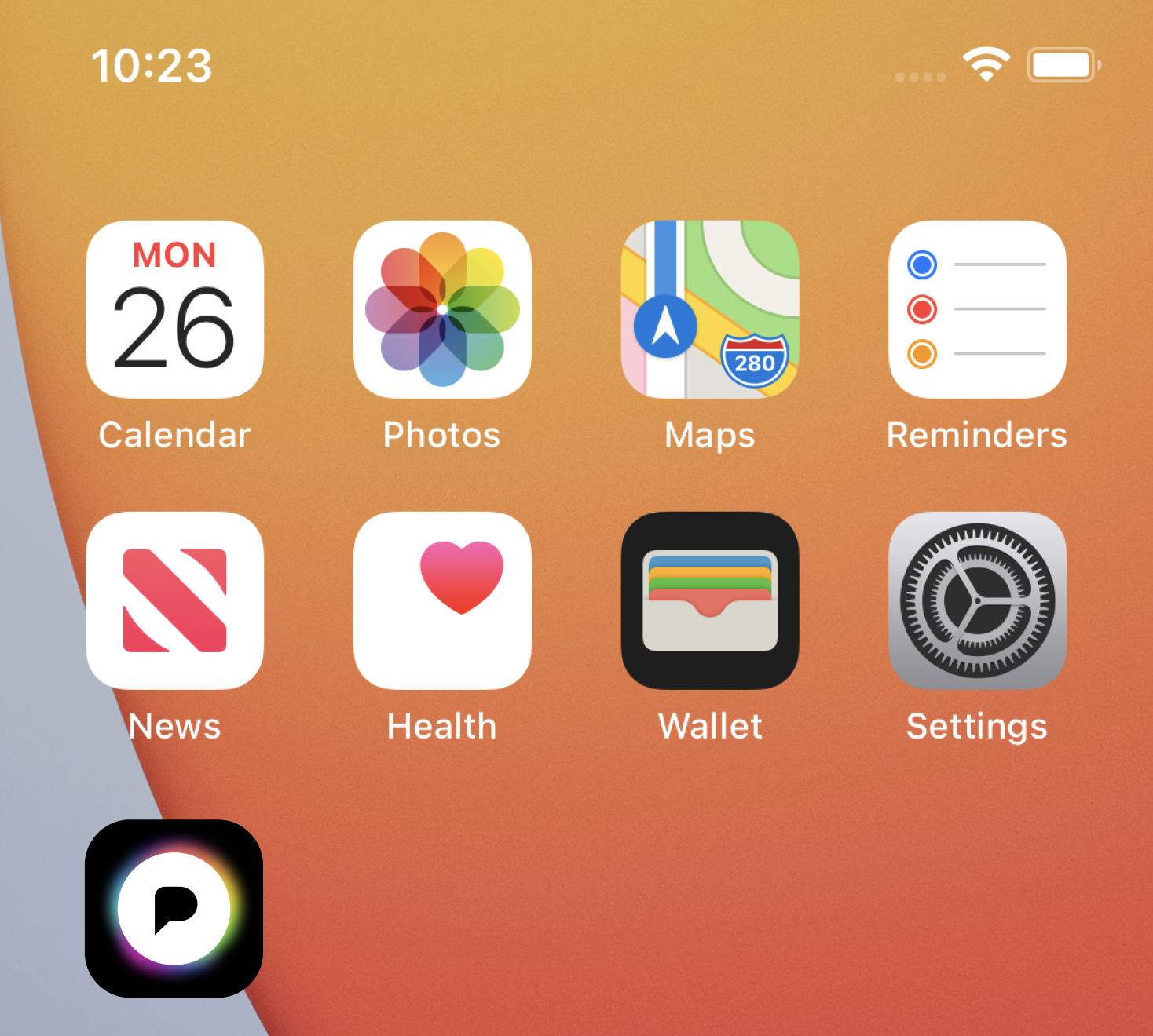
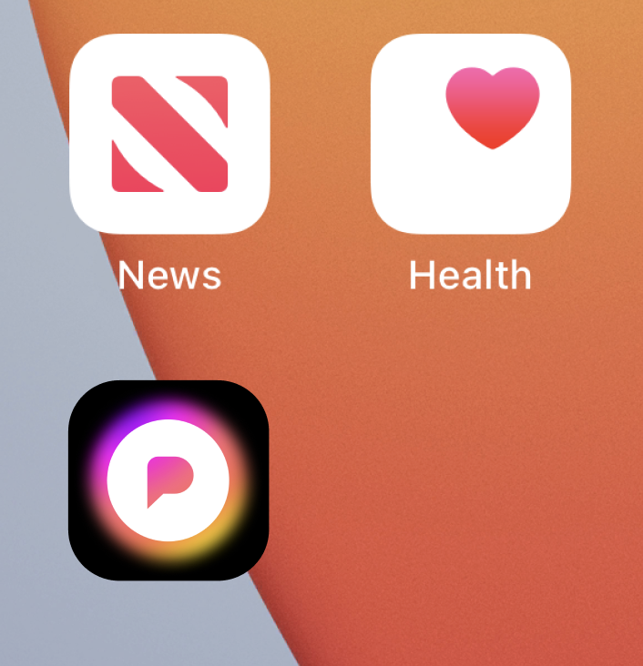
@dansup I hate to say make the logo bigger, but make the logo bigger. It should feel balanced against the background – as is, it seems like there’s more background/whitespace than logo. Looks like it’s politely shrinking away compared to other current iOS apps.

0
1y
Replies