- 1y ·
-
Public·
-
mastodon.social
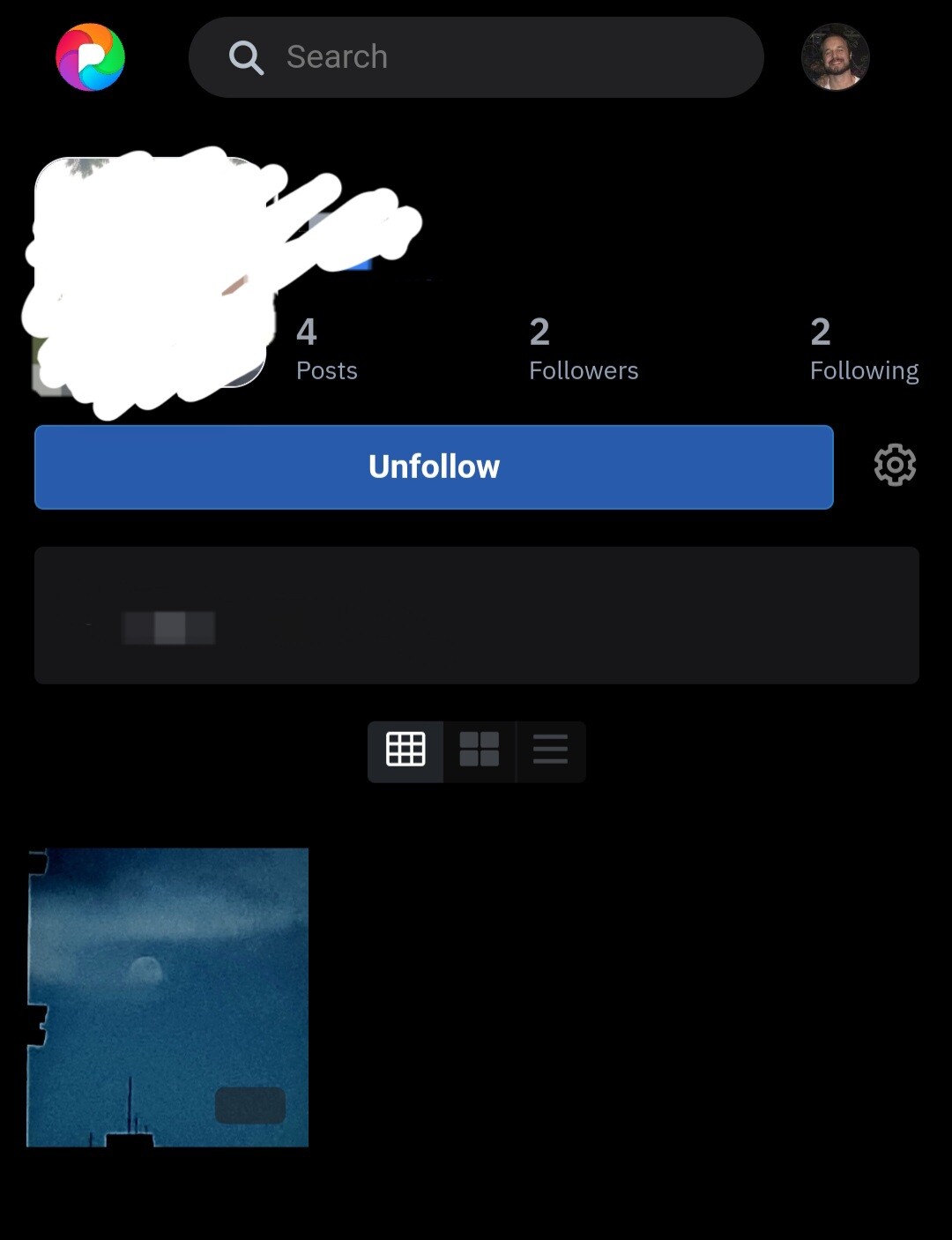
With nav menu VS without nav menu
The latter looks cleaner, and will support left/right swipe to quickly change feeds
With nav menu VS without nav menu
The latter looks cleaner, and will support left/right swipe to quickly change feeds
@dansup someone could explain to me why comments on others photos are considered posts? I think that's an unexpected behavior.

@dansup looks great! Will there be an equivalent iOS App?
@dansup This looks sick! Love the better use of space. I am concerned new users won't be aware there's other menus though. Is there a way to add maybe a couple pixel high bar at the top where the nav menu would be? Something to prompt the user to swipe to show other feeds/indicate which feed you're on? Just a thought...
@dansup looks pretty good, time to get rid of instagram too, after twitter and reddit